Neue Radial Soft D fonts from Neue - (qlwgg)

Neue Radial Soft D
Neue Radial Soft D Neue Radial Soft DNeue Radial Soft D


Want to test the fonts before you buy? Request fully functioning trial fonts here: hi@neuefoundry.com


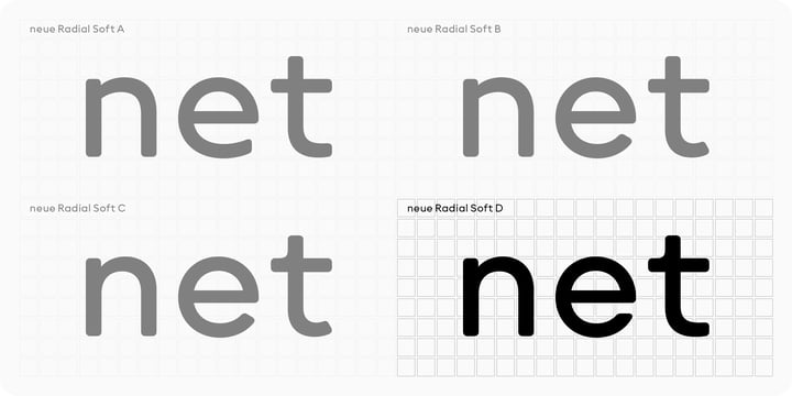
neue Radial Soft is not what it seems at first sight. Most certainly it is not another geometric grotesque, but an impeccable visual system that unites four of the most popular sans serif genres of recent decades, integrated in this superfamily under the suffixes A, B, C and D.


neue Radial Soft A follows the idea of New Functionalism that cultivates the model of the original London underground typeface in some details, while neue Radial Soft B exemplifies the roots of a rational grotesque of the late twentieth century, a continuous success-story. neue Radial Soft C is a contemporary representative of the geometric sans, mechanically constructed to optically appeal to the appearance of a true ‘compass and ruler’ typeface. Avant-Garde-esque elements ensure a smooth transition into neue Radial Soft D that reflects the tradition of neo-grotesques. 


The capital letters in all four families, almost square in appearance, follow an ancient model first demonstrated in the Roman capitalis. With only little metamorphosis from one family to the next, the capitals constitute the backbone of neue Radial Soft, although a common denominator also lies in the overall structure of several prominent lowercase characters such as a, b, d, h, i, n, u. At the same time, details in stroke endings, strokes that enclose counter forms and transitions from bows into stems are carefully adjusted in detail to match the respective genre. The system successfully merges the three traditional stroke endings, i.e. vertical, diagonal, horizontal, and joins organic with mechanical stem structures. As a result, each family member speaks its own dialect, while all four stylistically share the same language. In other words, the range of weights, number of glyphs and font metrics are identical in all four families that each offer their own style and expression.


Let’s be clear, neue Radial Soft is a highly consistent design machine. Each family comes in no less than 18 weights ranging from thin to black, decorated with regular and book weights, if necessary. No need to mention different sets of figures, but essential to point out squared and circled digits as well as several styles of arrows allowing for extensive use in identities, information design and orientation systems.


Don’t forget to check-out the remaining family member: neue Radial


Visit www.neuefoundry.com for more


Neue Radial Soft DDownload NowView Gallery


Popular posts from this blog

Download TT Marxiana Fonts Family From TypeType

Download Now Server 1 Download Now Server 3 Download Now Server 2 TT Marxiana is a project to reconstruct a set of pre-revolutionary fonts that were used in the layout of the "Niva" magazine, published by the St. Petersburg publishing house A.F. Marx. In our project, we decided to focus on a specific set of fonts that were used in the preparation and printing of the "Niva" magazine in 1887, namely its antiqua and italic, grotesque and elzevir. As part of the TT Marxiana project, we sought to adhere to strict historicity and maintain maximum proximity to the paper source. We tried to avoid any “modernization” of fonts, unless of course we consider this to be kerning work, the introduction of OpenType features and creation of manual hinting. As a result, with the TT Marxiana font family, a modern designer gets a full-fledged and functional set

Download Hawkes Fonts Family From Kimmy Design

Download Hawkes Fonts Family From Kimmy Design Hawkes is an extensive handmade typeface family that comes with a bundle of weights, widths and styles, all designed to work cohesively. Here is a breakdown of the Hawkes family. Hawkes Sans: The primary subfamily is a sans-serif typeface that includes nine fonts: three weights (light, medium and bold) and three widths (narrow, regular and wide). Within this set are an array of stylistic features; including small capitals, character style alternatives, discretionary ligatures and contextual alternatives. See details below for more information on OpenType Features. Hawkes Variable Width Sans: The secondary subfamily is the same base sans-serif fonts but combined in variating widths. Essentially, it takes all three widths of each weight and randomly mixes them together. This creates a funky and creative alternative to the more traditional sans-serif set. The variations are for the uppercase, lowercase, small cap

Download Stadtmitte Fonts Family From Letritas

Download Now Server 1 Download Now Server 3 Download Now Server 2 Stadtmitte is a grotesque font with a distinctly industrial flair. It is inspired on a reinterpretation of the Berlin’s vernacular signs and characters created under the DIN 1451 norm. By the early 1900s, german painters and sign makers started to spread this unmistakable way of font drawing used back then on freight trains. Such letter design was both very easy to read and build, hence it started to quickly spread until it became a standard in 1936 for highway signage. Stadtmitte is not aimed to be yet another literal remake of those drawings but rather a revision of shapes and concepts that seeks to transport us to Germany’s industrial way of creating and displaying information, therefore being suitable for a wide scope of design uses, considering its own nature and different available weights. T